Sherwin Williams Quietude Coordinating Paint Colors and Decor
Quietude paint color from Sherwin Williams is a beloved best seller and has been for years. It’s a neutral that can be used with both warm and cool colors. Let’s take a look at some of my favorite Quietude coordinating colors and decor.
This post contains affiliate links for your convenience. I may make a small commission on products purchased with my link, but your price does not change. As an Amazon Associate I earn from qualifying purchases. For full disclosure go here: Disclosure and Policies. Thank you for supporting my site and small business.
How to Decorate with Quietude from Sherwin Williams
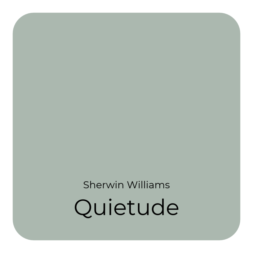
Quietude SW 6212 is s soft blue gray with a hint of green undertones. It’s a lovely and serene paint color that is ideal for bedrooms, bathrooms, cabinets, exterior siding and doors, and more. It can appear different based on your lighting, so testing the color is recommended.
What Colors Coordinate with Sherwin Williams Quietude?
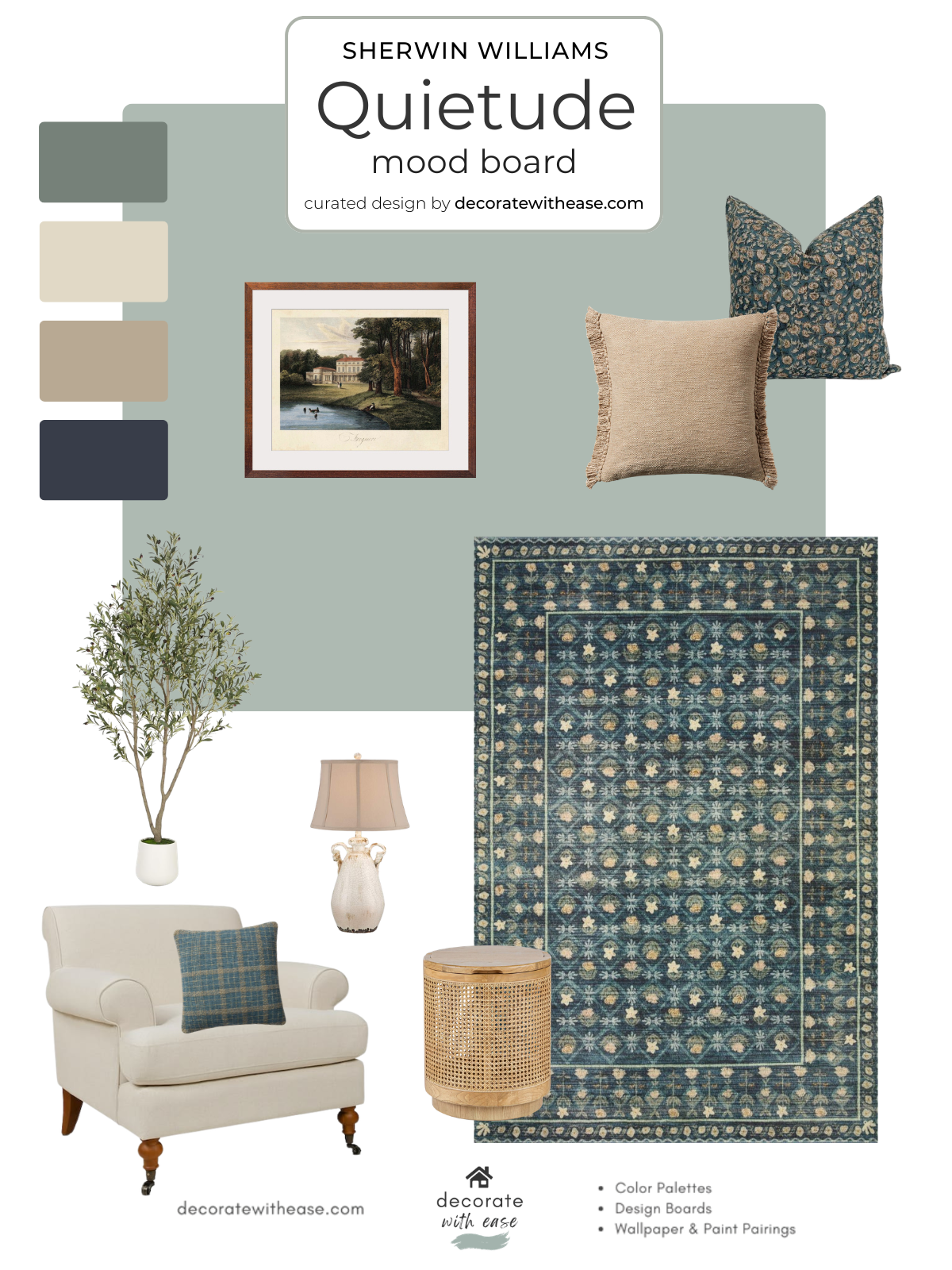
In this mood board I’ve paired it with a medium gray-green, off white, khaki, and dark blue. There are many more colors that can be used with it though. Soft blush, sage green, or muted yellow pair nicely with it for an understated look. Or terra cotta, gold, and deep bronze for a bolder look.
Quietude Color Scheme and Coordinating Decor
These are just a few items that you can use with this popular paint color:
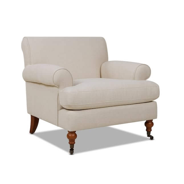
- Off White Upholstered Chair
- Dark blue area rug
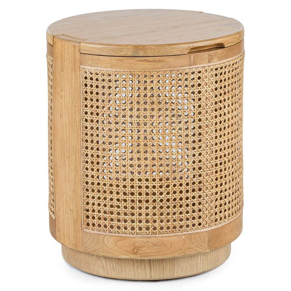
- Woven round storage end table
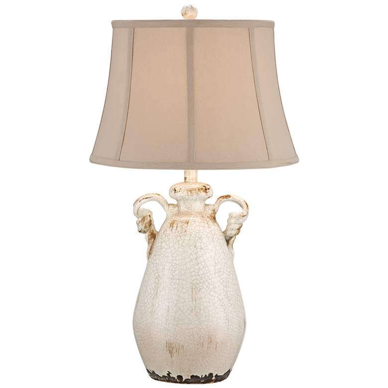
- Off White Crackled Vase lamp
- Faux Olive Tree
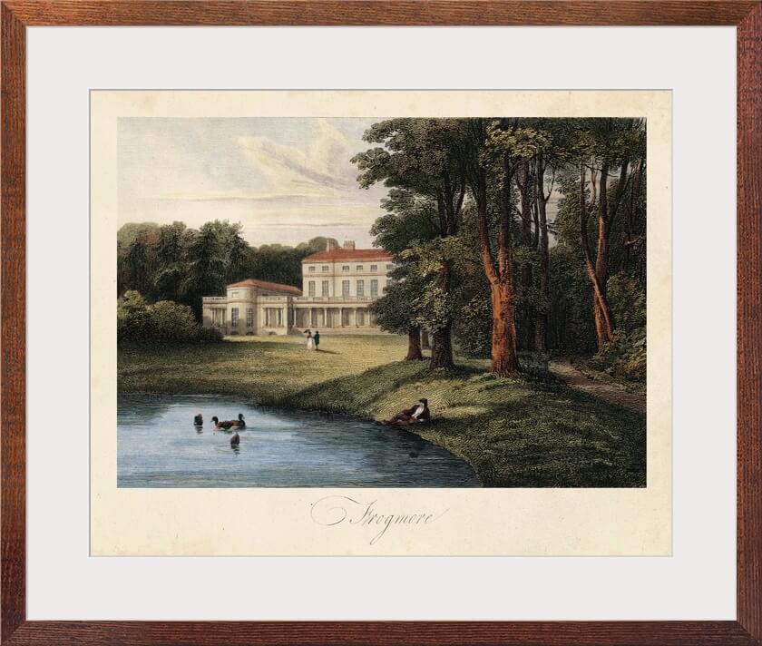
- Old World style Wall Art
- Dark teal block print pillow
- Khaki woven pillow
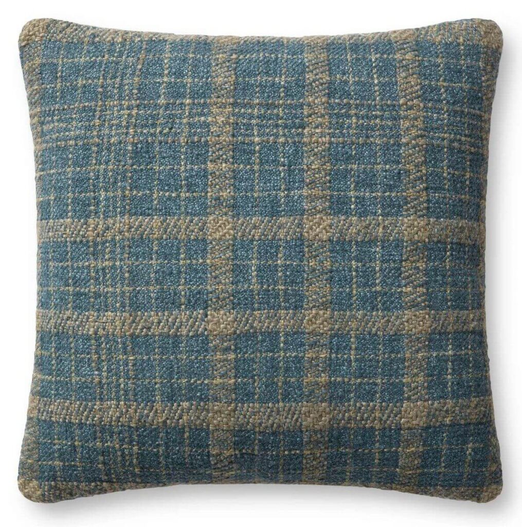
- Teal Plaid Throw Pillow
Shop the Look
Click on any item for shopping resources.




Paint Color Samples


What are you thoughts on this color? Would you use it in your home? Leave me comment below and let me know!